
Color correction and color grading serve two different purposes in photography. Color correction fixes exposure, white balance, and unwanted color shifts to make a photograph technically balanced. Color grading goes further, shaping color, contrast, and tone to create a particular mood or visual identity.
During the photo editing process, color correction usually comes first, establishing a starting point before moving into the creative decisions of color grading. However, applying color correction doesn’t necessarily mean a photograph has technical flaws, just as a color-graded image isn’t automatically better than a color-corrected one. What matters is the intention behind each adjustment and how it contributes to the final image.
Bonus for readers: Want more creative control over your color grading in Photoshop? Explore Infinite Tools and use code CWSAL15 to save 15% on your purchase.
Color Correction vs Color Grading
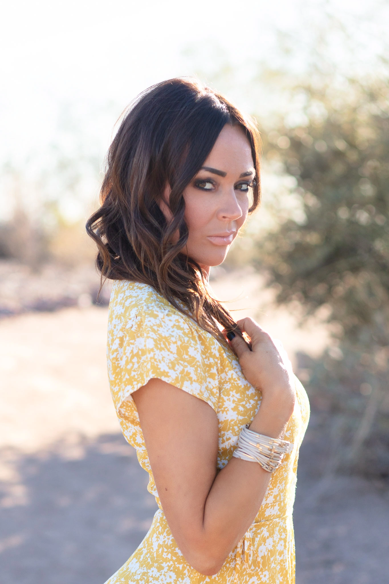
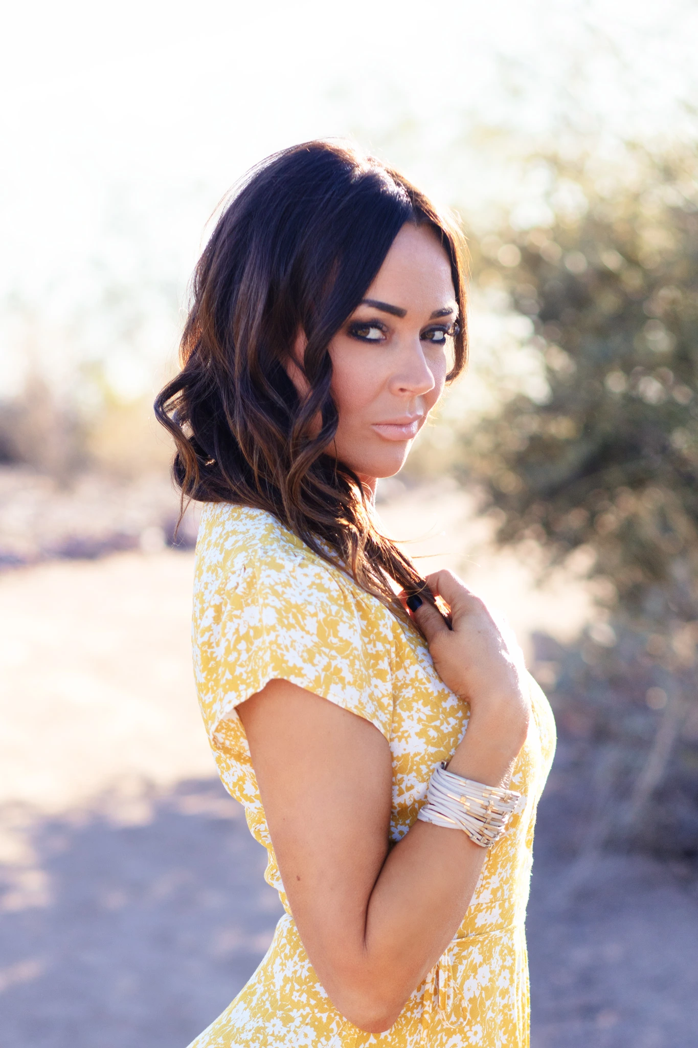
Both techniques modify the appearance of a photograph, but they serve different purposes. Here are the key differences:
- Color correction: Usually comes first, establishing consistent colors and exposure for a balanced, polished photograph.
- Color grading: Usually follows correction, creating a deliberate visual style that gives the photograph a stronger artistic direction.
What separates correction from grading is intention. Adjusting exposure and warmth to achieve a balanced photograph is color correction. Pushing contrast and introducing subtle shifts in shadow color to create a more distinctive mood is color grading.
What Is Color Correction in Photography?
Color correction is the process of adjusting a photograph’s colors and tonal values to create a balanced, consistent image. Before applying a creative look, color correction addresses unwanted inconsistencies while preserving the original character of the photograph. Common adjustments include:
- White balance: Removing unwanted color casts while preserving the character of the light.
- Exposure: Bringing the photograph’s overall brightness into an appropriate range.
- Highlights and shadows: Controlling bright and dark areas while preserving important details.
- Contrast: Establishing depth and tonal separation.
- Saturation and color: Correcting unwanted color shifts and maintaining consistency throughout the image.
Our approach to color correction is primarily about removing accidental inconsistencies while preserving the qualities that made the photograph worth selecting in the first place. Often, all it takes is a few subtle adjustments to make the image pop without compromising its original character.
What Is Color Grading in Photography?
Color grading is the creative process of manipulating a photograph’s colors, tones, and contrast to determine the visual atmosphere of the finished image. Color grading can help create:
- Cinematic aesthetic: Controlled color separation, deeper shadows, and deliberate tonal contrast.
- Nostalgic feel: Warmer highlights, muted colors, and softer transitions.
- Editorial tension: Restrained saturation, cooler tones, and stronger contrast.
- Film-inspired character: Color palettes and tonal behavior associated with photographic film.
- Visual consistency: A recognizable look that connects photographs across a series.
Color grading is an essential part of photo editing because, when done well, it shapes the mood, strengthens the visual narrative, and elevates the overall impact of an image.
Color Corrected vs Color Graded
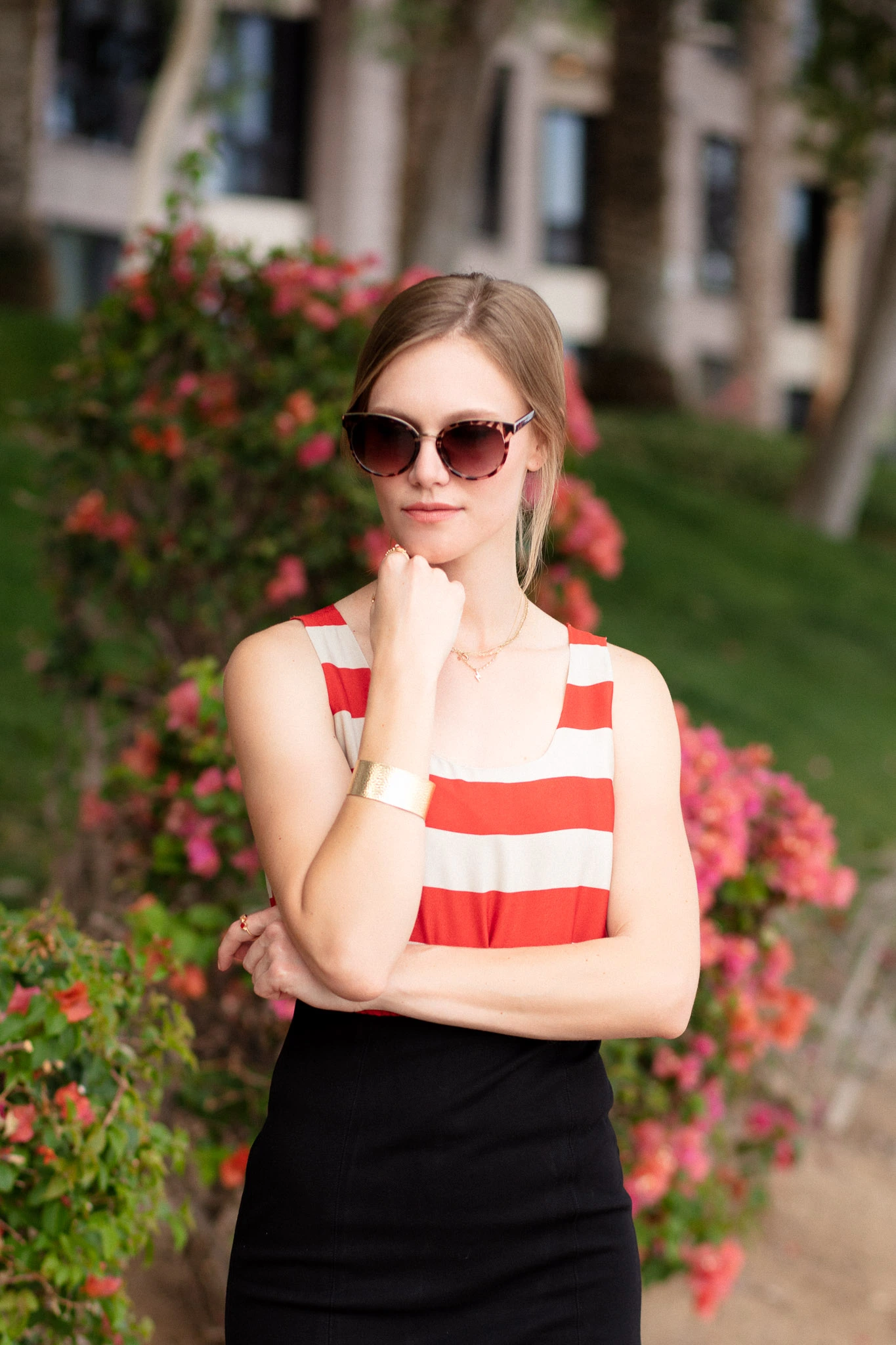
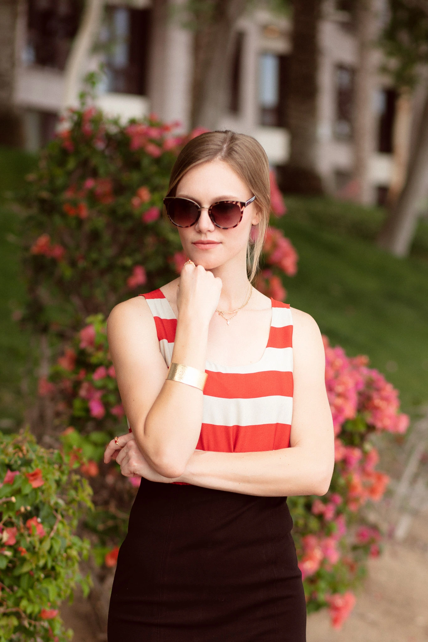
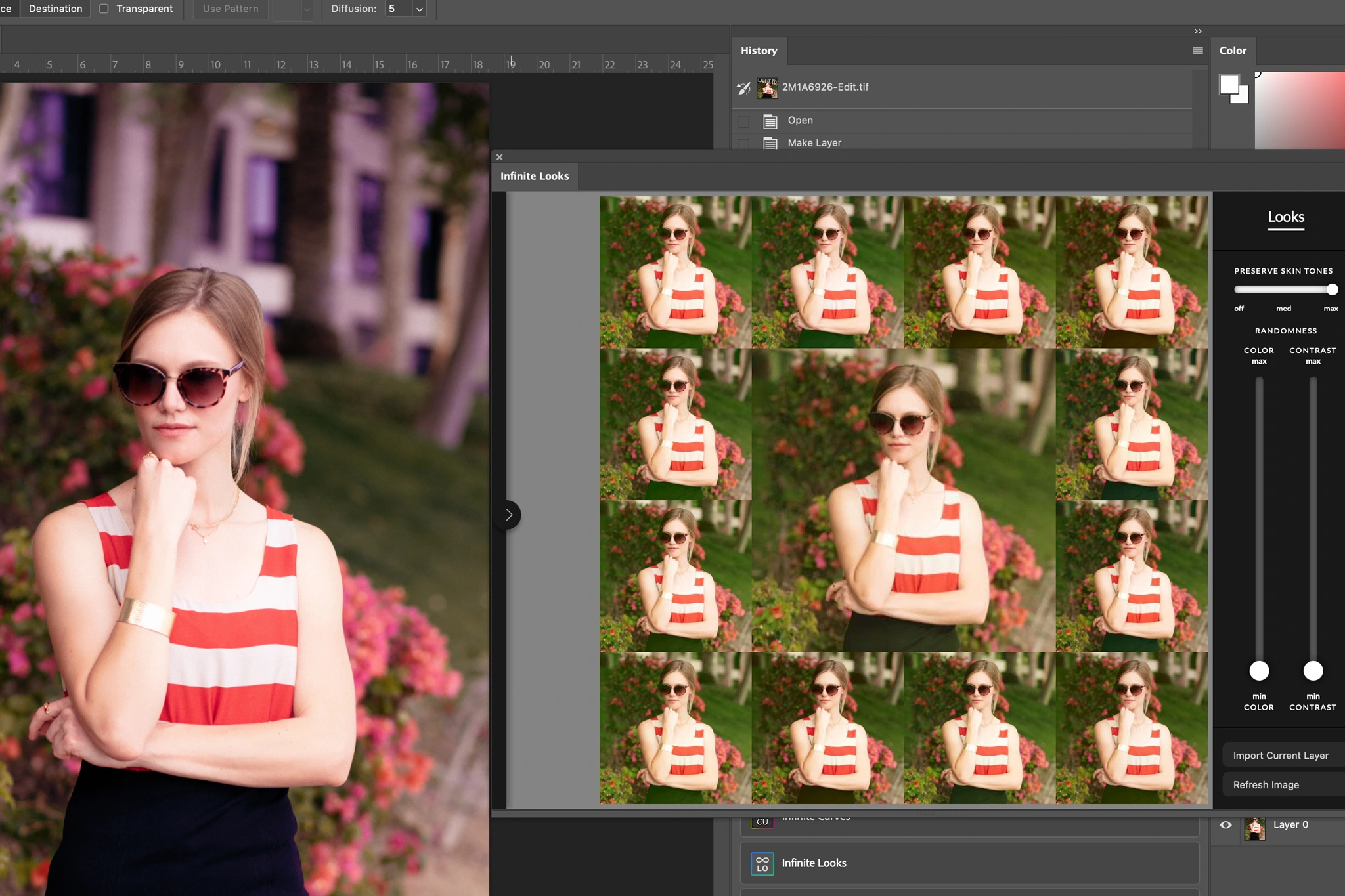
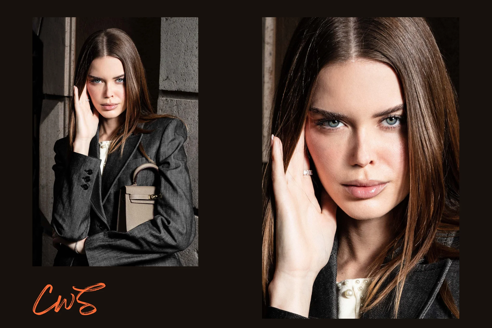
In the portrait above, the color-corrected version establishes a natural starting point, while the graded result, created with Infinite Tools in Photoshop, introduces a subtle editorial look with a light magenta shift. For this example, we used the Infinite Looks plugin, which makes exploring different color palettes and contrast treatments surprisingly intuitive. Its visual previews let us experiment non-destructively, while the Preserve Skin Tones control helps maintain natural-looking skin. Applying the final look as a separate layer in Photoshop gives us additional flexibility to refine the result without losing that believable editorial finish.
Infinite Tools makes the most sense for photographers who regularly experiment with color, particularly in editorial, fashion, and conceptual portrait photography. Use code CWSAL15 to save 15% on Infinite Tools.
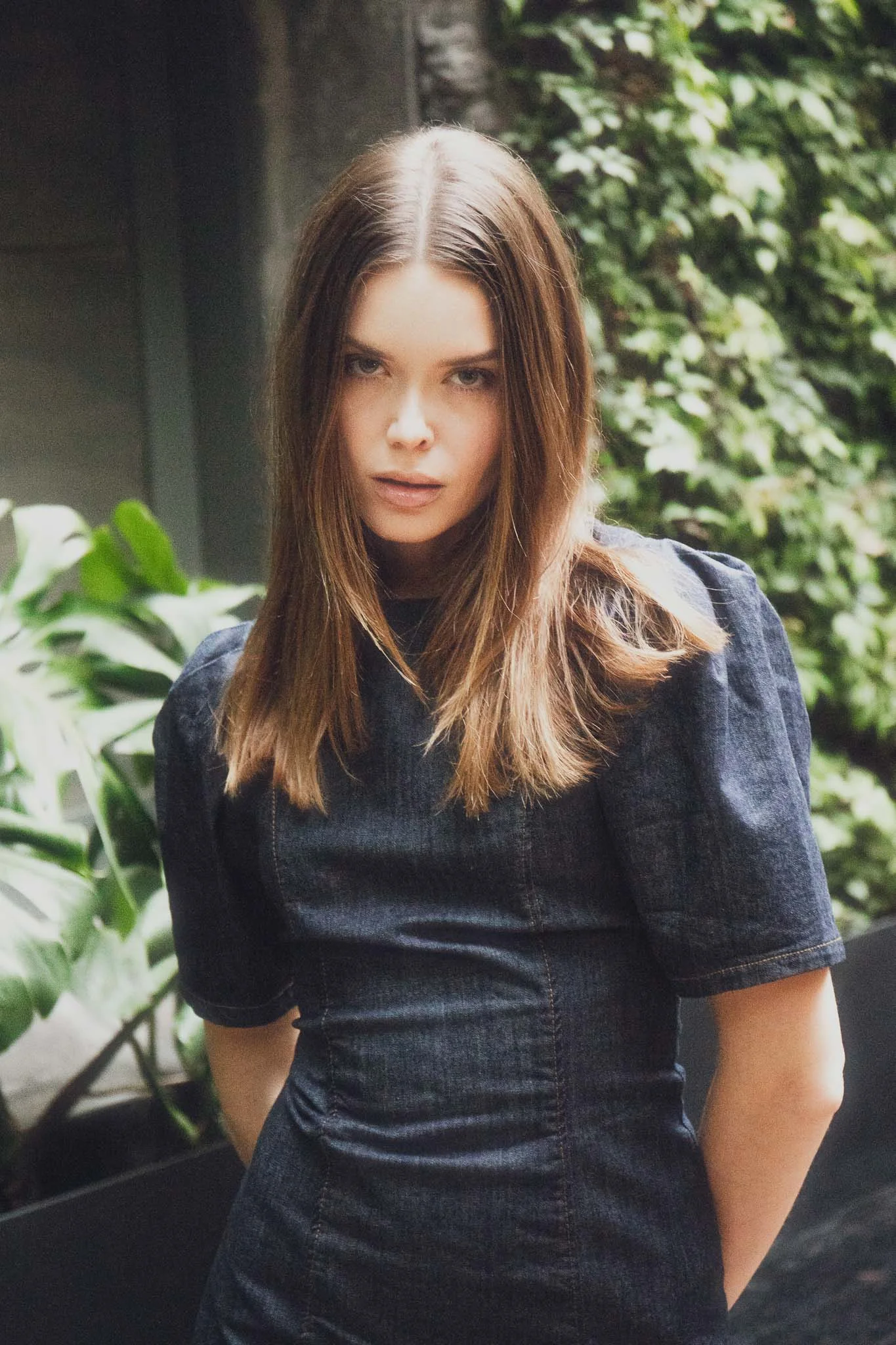
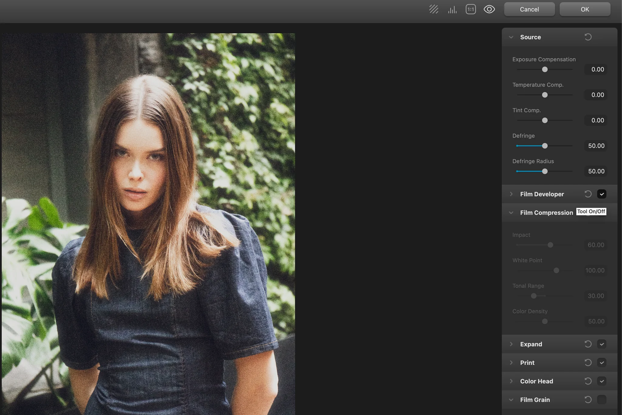
For the photograph above, taken during our Mexico City model shoot, we opted for a film-inspired color grade. A convincing analog look goes beyond applying a preset. It comes down to the relationship between shadows and highlights, color response, tonal compression, and how texture interacts with the image. This is where we’d turn to Dehancer.
Dehancer is particularly useful for photographers working with film-inspired portraits, atmospheric travel photography, or cinematic imagery. If that matches your creative direction, use code CWSPROMO10 to save 10% on Dehancer.
Color Correction vs Grading FAQs
Color correction focuses on balancing exposure, white balance, and unwanted color shifts to create a technically consistent photograph. Color grading is a creative process that adjusts color and contrast to establish a specific mood, atmosphere, or visual style.
Yes, in most cases. Color correction establishes a balanced foundation, making creative grading more predictable and consistent. However, intentional lighting and atmospheric colors should be preserved rather than automatically neutralized.
Yes. Lightroom includes Color Grading, Color Mixer, Tone Curve, and masking tools that allow photographers to develop creative looks without additional plugins. Photoshop provides further flexibility through adjustment layers and selective color controls.
No. Some photographs benefit more from natural, accurate colors than from a stylized treatment. Color grading should enhance the image’s atmosphere and visual direction rather than become an unnecessary editing step.
Film color grading is a creative approach that draws inspiration from the color palettes, contrast, and tonal characteristics of photographic film. Plugins such as Dehancer can extend this process with film emulation, grain, halation, and other analog-inspired effects.
Key Takeaways
- Color correction is primarily technical, balancing exposure, white balance, and unwanted color shifts for a consistent photograph
- Color grading is primarily creative, shaping color, contrast, and tone to establish a deliberate mood or visual identity
- Correction usually comes first, providing a controlled foundation before developing a creative grade
- Lightroom and Photoshop can handle both processes, while plugins like Infinite Tools and Dehancer offer specialized creative workflows
- Not every photograph needs grading. The strongest edit is the one that supports the image’s atmosphere and visual story
Affiliate Disclosure: Some links or promo codes in this article may earn us a commission if you buy through them, at no extra cost to you. That does not change our opinion. We recommend tools based on whether they actually fit the workflow.











Leave a Reply